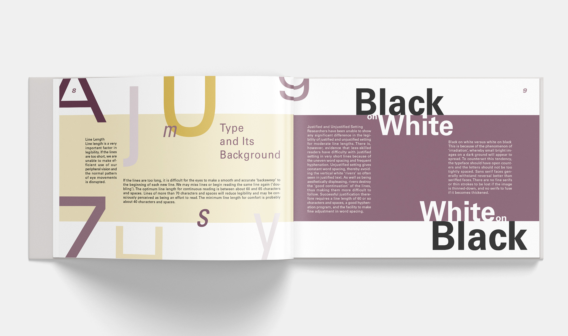
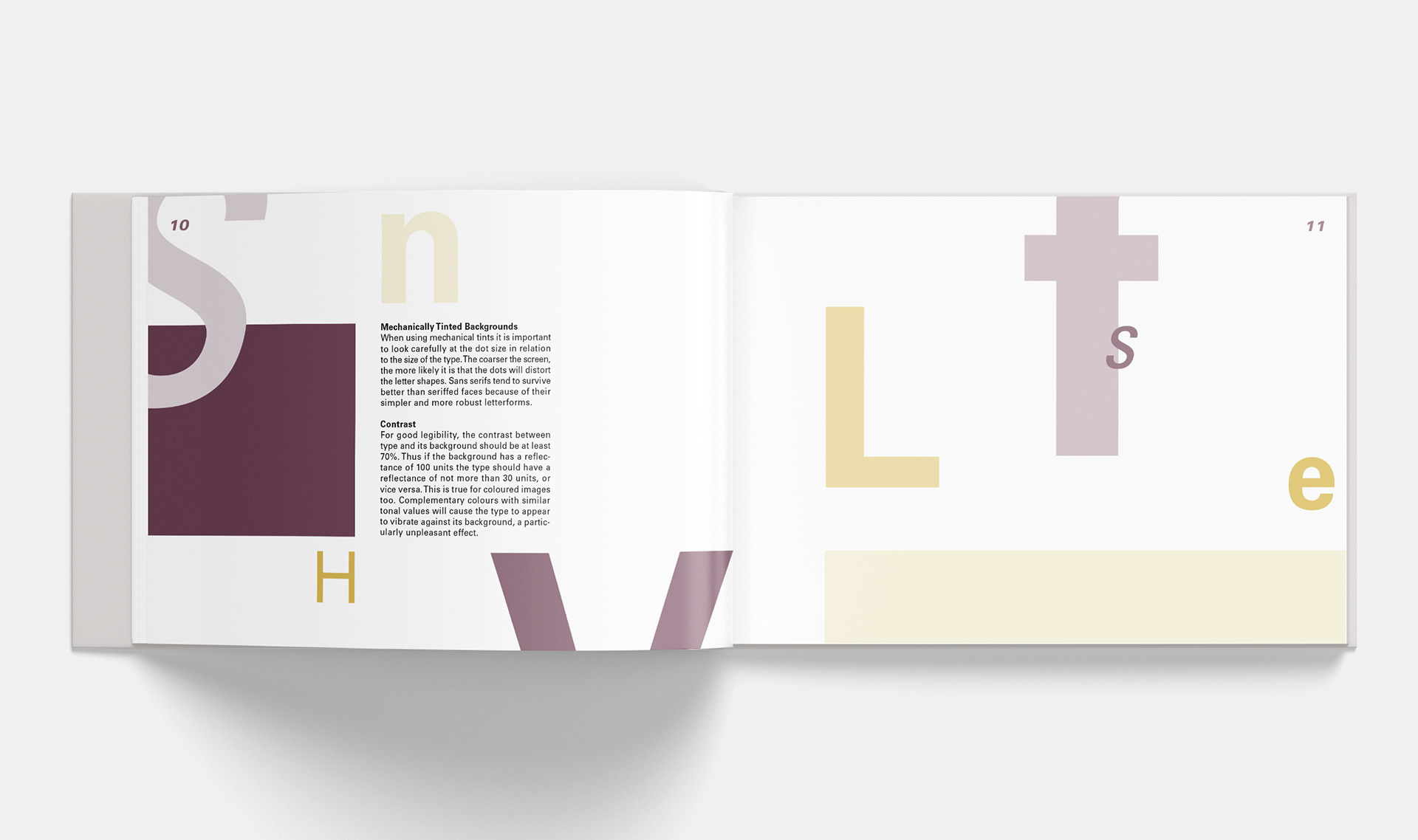
The Legibility of Type is a book designed to experiment with different variations of type. I chose to experiment with the arrangement of type as well as letterform. To keep things playful like I did with the arrangement of type, I chose to use purple and yellow for the color palette of this book. When I think of my first experimentation with color, the color wheel was the first thing I learned. Complementary colors gave me that sense of play in the creative dynamics of this book.